Argentinean born, artist Santiago Cucullu creates multi-media works that culminate in spatially unified installations. Often arranged with elaborate wall-sized murals, sculpture, and vibrant works on paper, Cucullu emphasizes the subtleties of intuitive pacing and spatial orientation experienced in his broad installations.

Cucullu currently lives and works in Milwaukee, Wisconsin and Boston, Massachusetts. He received his MFA from the Minneapolis College of Art and Design and his BFA from the Hartford Art School in Connecticut. Cucullu’s work has been exhibited at a number of institutions, including the Mori Art Museum, Tokyo; Whitney Museum of American Art, New York; Walker Art Center, Minneapolis; and Hammer Museum, Los Angeles, among others.

A: You received the Artadia Award in 2003. Can you talk a little bit about what you were working on at that time?

SC: In 2003 I was in my last year as a Glassell Core Fellow, and was making both large scale wall paintings using adhesive vinyl, paired down nonrepresentational sculptures made with a simple armature covered with purloined airplane blankets. I was also working on large and small-scale watercolors. I use representation pretty often, but resists denoting a thing or slinking toward a metaphor. This goes back to an early instilled reverence towards modernism. The subject matter I was addressing was a mix of everyday fantasies, “what-if” and anachronistic situations, for example, “what if Joan of Arc was best buddies with Louis Riel.” The year before, I had made a series of watercolor drawings with the working title “Death Machines Fucking”. These were colorful and visually endearing, but with the notion being, if state execution devices could have sex, what would that look like. So, pretty but at the same time off-putting.

My sculptural work would look almost abject, slightly funereal. I use the term sculpture only in the loosest sense of the word, because of the sometimes mundane nature of the materials. I would utilize plastic decoration from the party store, scrap wood that I found, as well as items I randomly came across such as airline blankets. I was interested in elements and materials that could be organized and thought of in more than one way, materials where someone may have already made an aesthetic choice, and were the purpose was now other than then its original function.  The airline blanket projects were a nod to Jac Lernier’s airplane ashtray sculpture, as well as to my mother’s habit of keeping the complimentary blanket after a flight. 

In the case of the party materials, I found myself in the party store by accident and was intrigued by the fact that shoppers were making similar aesthetic decisions to those that I was making as an artist. The thought process was always either about feeling or prescribed codes: black and white for formal, pink for valentines, red and green, and white for Christmas, Halloween was the best with purple, orange, and black. If the end results were more variable and a bit less mannered, a viewer would be able to have one several point of approach as opposed to one privileged vantage for seeing the work. The work itself could be organized in a few different ways, and occupy a variety of modes of being perceived. The exhibited form could be one of many possibilities given the object. The underlying armature could be replaced, or shifted, or if the thing was kicked or knocked over, set up again in a different format. It was art with a small ‘a’. Not so totemic and imposing as the larger wall works I was making. 

Maybe, perhaps something to point out is that there was a performative aspect to installing something that had inherent limitations. I was interested in underlining that a moment is tenuous even though the nuances of seeing an exhibited object are variable.

I recognize in myself, an aesthetic proclivity for artists like Tex Avery and John Waters, or publications like Mad and Cracked magazines, or situations when someone is using a car-jack to replace a rotten beam to support a porch. Moments where we find an interruption that is very personalized or when the order of things has been disturbed. An example of this is the Argentine graffiti writer who writes “No me baño” everywhere. Sometimes they’ll add a caveat like, “y soy virgin” or use lettering that is illustrative or an illustrator like Patrick Nagel who denotes a specific time and circumstance.

Here To Go, 2014, Adhesive vinyl, 5 one channel videos with monitors, 1 two channel video with monitor, Glass shelving, spray paint, tin foil, framed photo, found plastic figurine 28’ x 18’, Installed at Madison Museum of Contemporary Art
Detail, Here To Go, 2014
Dry Earth and Sea (with detail), 2019, Digitally printed adhesive vinyl, glazed earthenware, 11' x 11'
Avalon Vortex (Zodiac with Merlin and 11 plates), 2018 Wheat-pasted print with ceramics, 18’ x 9’

A: In your exhibition “A Softer Side of Futurism” at the Dean Jensen Gallery, can you talk about the title of the show and what you wanted to touch on in your work?

SC: A month or so before the show I was looking through bins at a record store and found an album, Provocative Piano by Dick Hyman and his Orchestra. The cover was designed by S. Neil Fujita who at one point worked for Columbia records.  A few things were going through my mind: Dick Hyman and his Orchestra are not my bag, but I love the cover. I really enjoy flipping through albums. It’s like scrolling through time and other people’s loves and desires, far from when some of this information was contemporary or relevant. It’s a moment where I’m sort of lost in this time travel and all of this information just washes over me as I flip through the stacks. 

I always thought there was an irony that Futurism, an aesthetic movement displaced by frankly horrible beliefs, still exists and has been resuscitating visual elements of itself over a period of a hundred years. When the Futurists started they had a half-baked manifesto written by Marinetti, a well-to-do misogynist gadfly who liked fast cars and the idea of modern technology while repudiating any connections to art of the past. The work looked new and fresh, and I’m sure at the time completely out of this world. But, here I am 100 years later, looking at a completely vanilla album from 1960, and the world is still what it is. The nationalist routed Italy and the world, yet those same forces still seem prevalent in our world. 

The imagery for the show A Softer Side of Futurism came directly from collected photographs of moments and circumstances that I found touching, a little weird, or funny. When pushed out of context, they captured a sense of melancholy. Futurism was undeniably impactful on the prism with which I was viewing modern painting and modernity. However much of the thoughts exposed in Futurism, where completely in opposition to what I felt or believed. —The original Futurists movement ended before WWI, but many of the original tenets bore nationalist tendencies.  Marinetti one of Futurism’s founding members, was a Fascist until the end and later formed a political party in opposition to parliamentary democracy. And although the aesthetic sense of cubist abstraction and modernist painting was tolerated by early Fascists, later right-wing Fascists decried it as degenerate art. Once Mussolini was hung, associations with a defeated and discredited regime quickly fell out of favor. What remains are stylistic embellishments that seem to announce, “this is the modern world.”

The watercolors drawings in the show had a sweetness and captured scenes that could be thought of as asides or even banal; however added up to a sliver of the world that exposes an underlying vulnerability. A man wearing all black and a heavy goth-style cape is walking past the mostly industrial environment where my studio is, a model boat in a window of a flat in Hamburg, a girl crossing a stream with a waterfall behind her, graffiti on a covered walkway in a fancy part of Buenos Aires, a mannequin head in a display case in a German subway station on a Sunday, and a disused crutch lying in my friends’ garden. All these bits of everyday life are set against a black and white backdrop of large Xerox print murals from images taken from the last moments of 2014 and the first instances after New Years’ Eve 2015. When it came time to name the show, I decided to use the title of one of the small watercolors.

The Seed of Nijinsky, 2019, Xerox and glazed earthenware, 175′′ x 131′' , Courtesy The Alice Wilds
Hypnotist Collector (hummed to the tune of “She Belongs to Me”), 2019, Xerox and glazed earthenware, 177″ x 127″, Courtesy The Alice Wilds
Rockefeller and the Dry Duchess, 2019, Xerox and glazed earthenware, 179″ x 109-1/4″, Courtesy The Alice Wilds

A: Can you tell us about some recent projects you’ve been working on?

SC: At the moment, I’m in the beginning phase of a project for the Madison Museum of Contemporary Art. I’m looking at a lot of concrete poetry, and making ink drawings that combine text and geometric designs. I like to use elements that can exist together while occupying differing polarities. 

I have also been collaborating on a bi-weekly soundscape and noise improvisation radio program with Chuck Quarino and Marc Ferch. We made an LP through Robin Rhodes’ record label in 2015. Recently we have been on hiatus due to the Covid19 virus, but the last four weeks started submitting shows that are now being broadcast on the radio and online.  

In my last two solo exhibitions, I wanted to work more with imagery that I have been making in my sketchbooks. Although, these are a daily part of my work, it is material I don’t usually share. I wondered if I could reconcile these drawings which feel goofy, odd, quasi-sexual, and make me uncomfortable when people see them with something contradictory—cold, mechanical, and that hides my hand. I have explored this in the past and found myself revisiting this thinking after making a body of ceramic works between 2015 and 2018. 

Walking Under Rain, 2018, Wheat-pasted print with ceramics plates, 12’ x 8’, Courtesy Galleria Umberto Di Marino
Easy-E Pours Olde English on Tatlin’s Monument to the Third International, 2006, 10’ x 6’ Adhesive vinyl
Installation view from the exhibition Chaos and the Imprint of Architecture, The Dolphin, Kansas City, MO 2006, Sculpture is 4’ x 7’, Wood, plastic strips used to keep flies out
75.Kansas installation view1
Installation view from the exhibition Chaos and the Imprint of Architecture, The Dolphin, Kansas City, MO 2006

A: In your work, you draw from a variety of sources – from historical events and works of fiction to the Milwaukee landscape and your own memories. What is your current inspiration?

SC: I’ve been trying to imagine Concrete Poetry, abstraction, and architecture intersecting. Also, and it dates me, I’ve been really enthralled by using Instagram. I only started using it on a regular basis last year, Brett Budsberg, an amazing sculptor from Milwaukee, suggested that I think about using it as an ongoing tally of inspirations that I encounter.

A: Can you speak on why you are drawn to installation as a medium for your work?

SC: When I was really young, I loved the graphic qualities of stickers, in particular skateboard stickers. Later, once I went to art school I had great instructors including Pat Lipsky Sutton, Chris Horton, Peter Mclean, and George McNeil. During college I had a particular way of making paintings where all the problems in the painting were solved by adding a horizon line. Once I graduated I decided to stop resolving paintings this way, which proved to be really detrimental. None of the paintings seemed to work and I hated what I was making. 

Around 1995, I was working in a small studio in Washington DC. I somehow met the painter Francis Ruytor, whom had opened a small gallery with Jon Routson around the corner from my studio. The way they were exhibiting work was an eye opening that would become incredibly influential. In particular, a small drawing by Lilly van der Stokker and sharpie drawings that Francis was doing directly onto walls.  When I started to exhibit work in group exhibitions, I tended to gravitate toward wanting to use spaces that were overlooked. I would install work in corners too close to power boxes, or spaces up high on the wall 

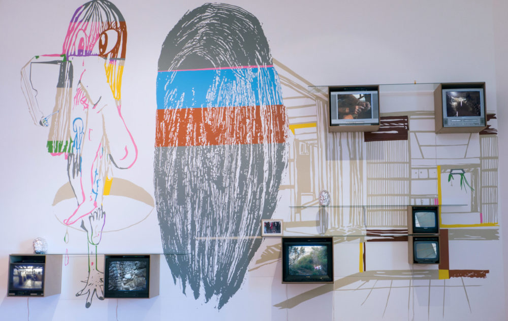
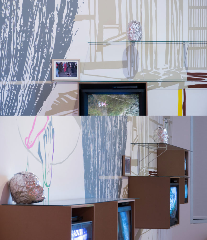
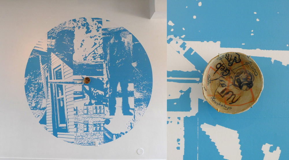
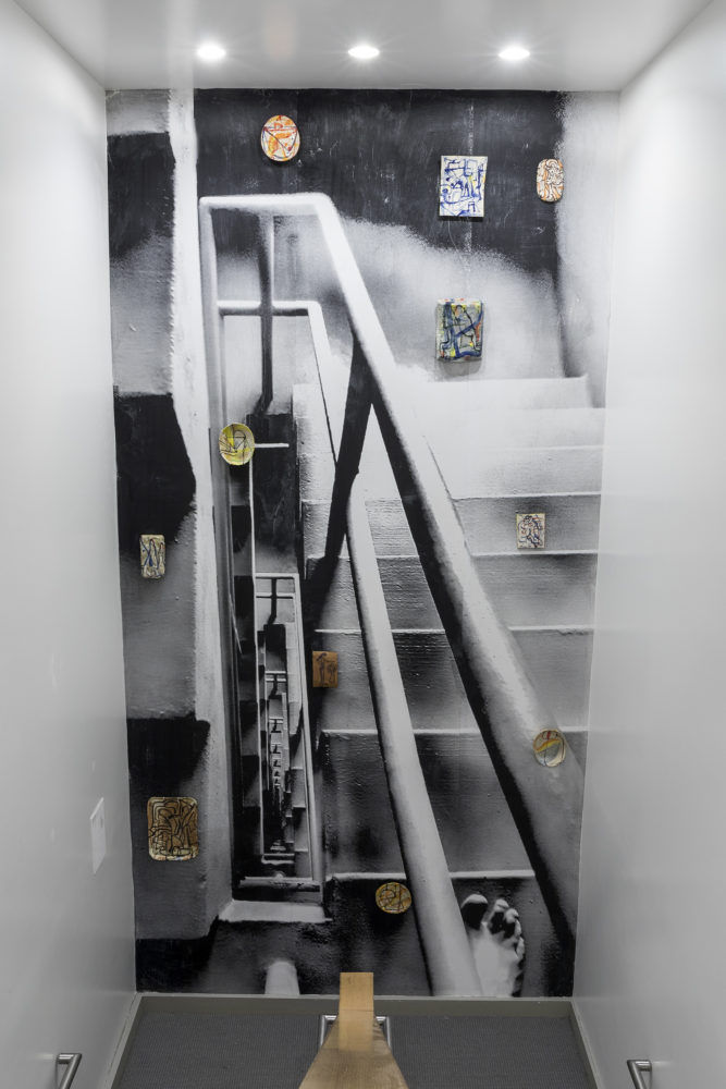
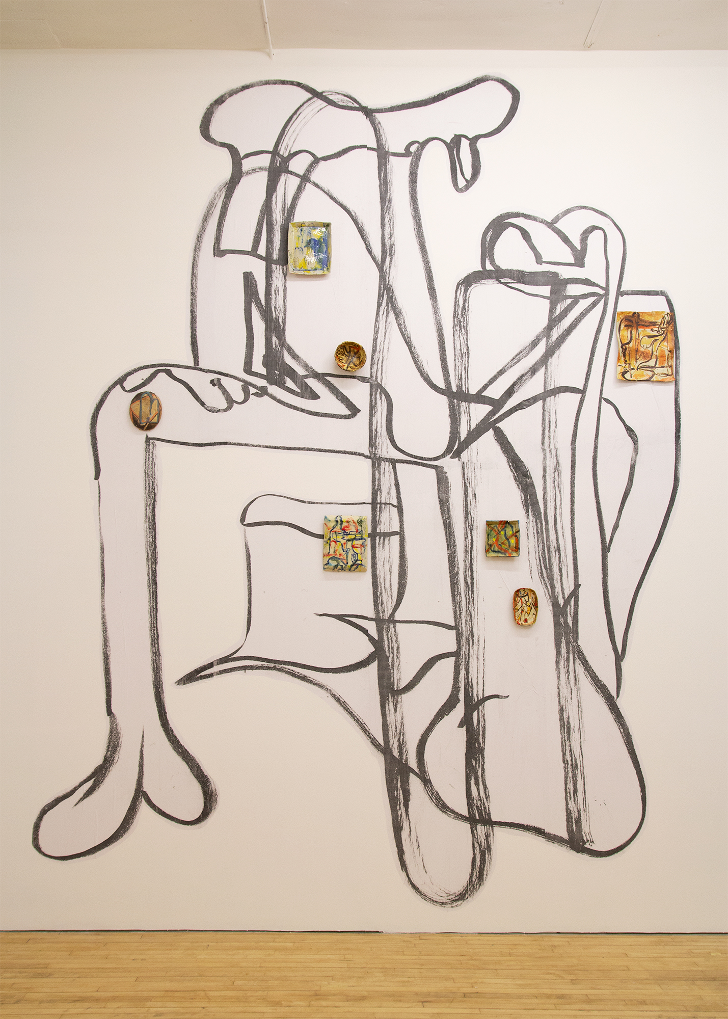
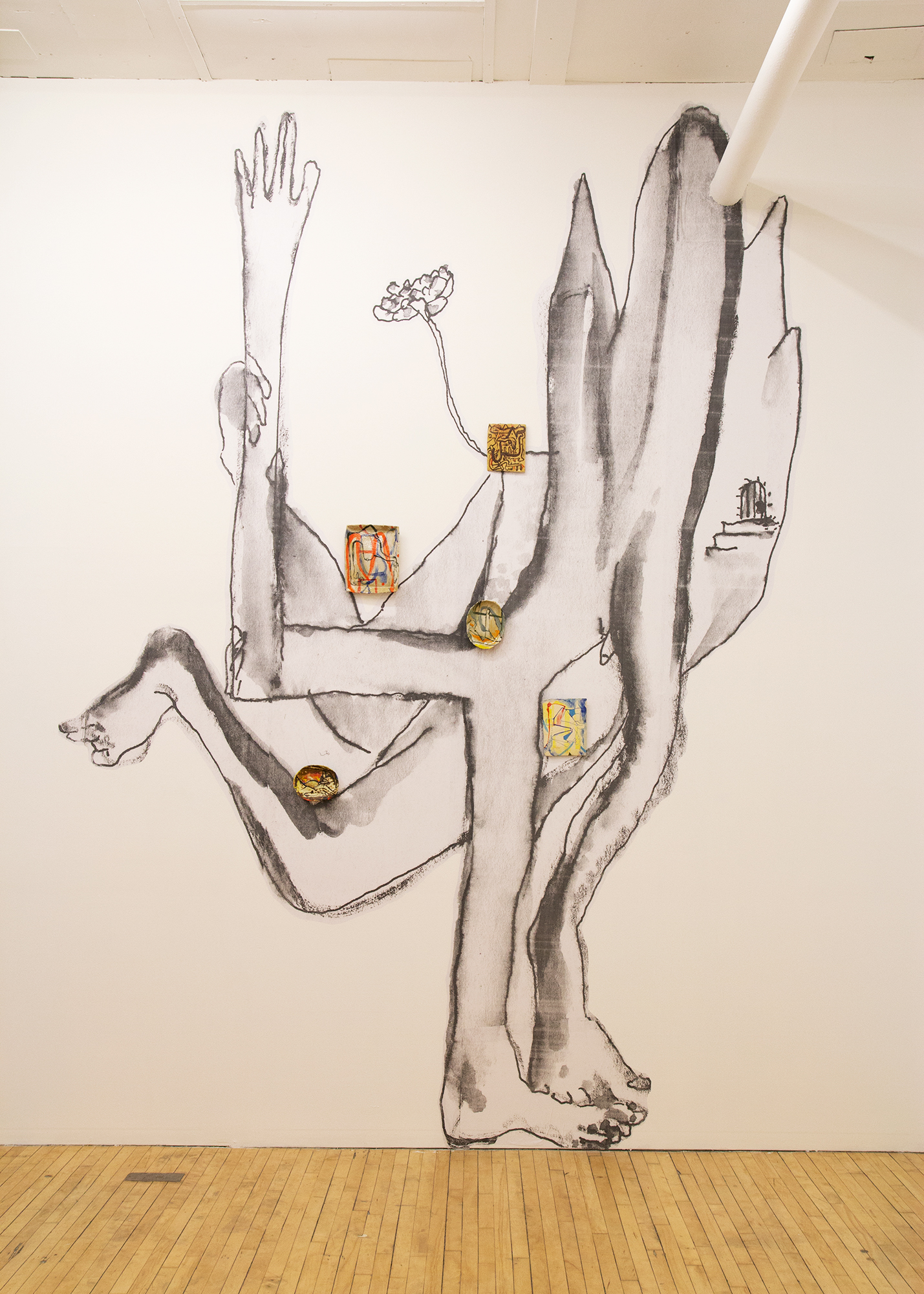
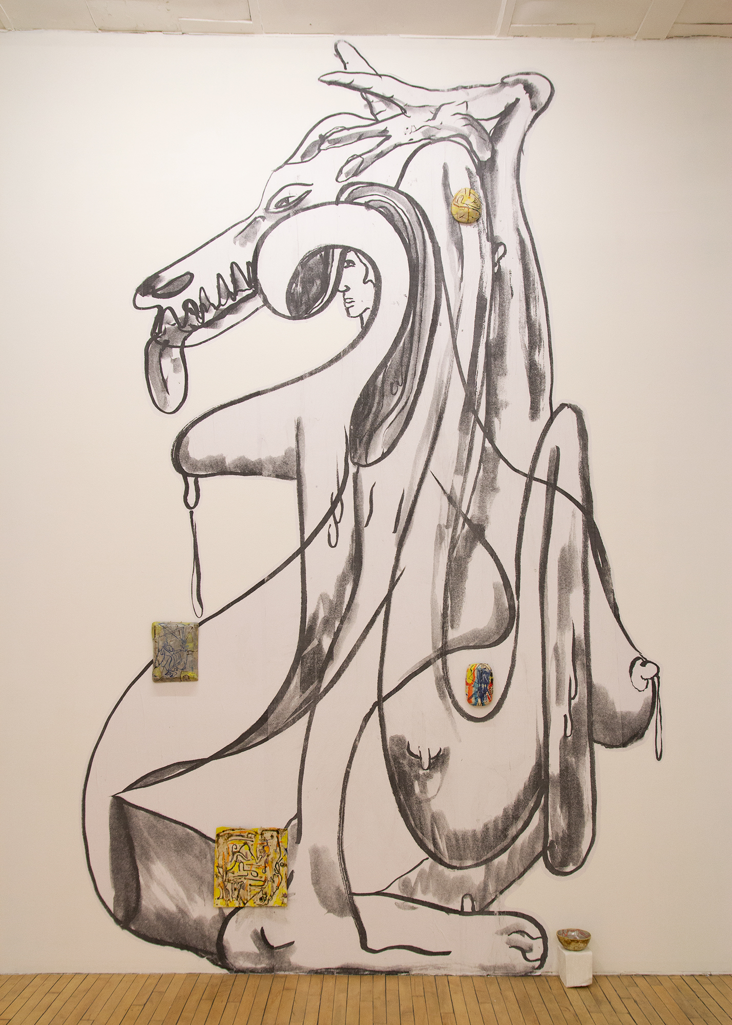
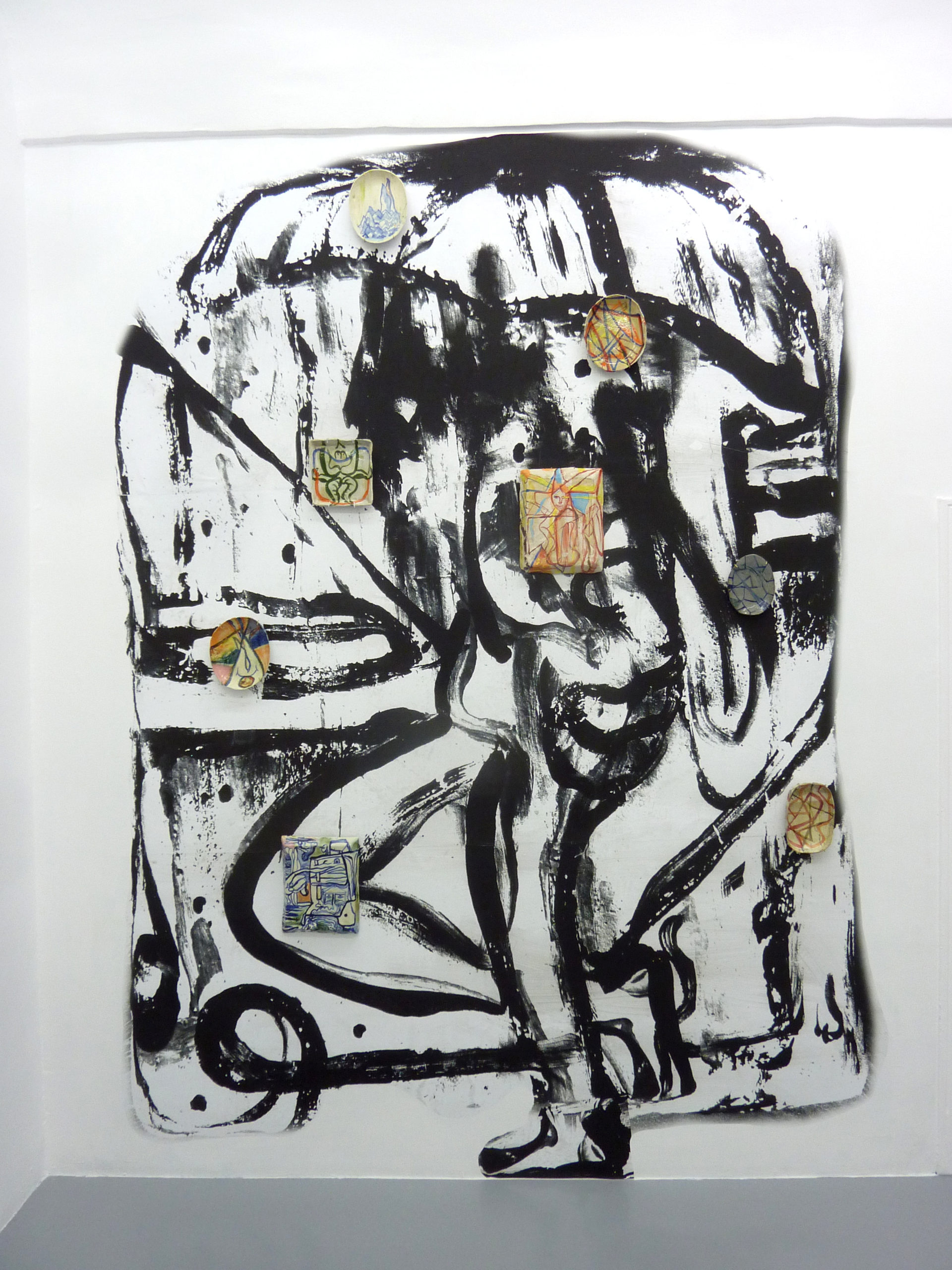
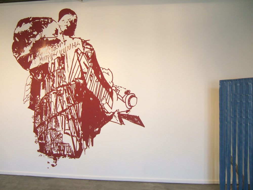
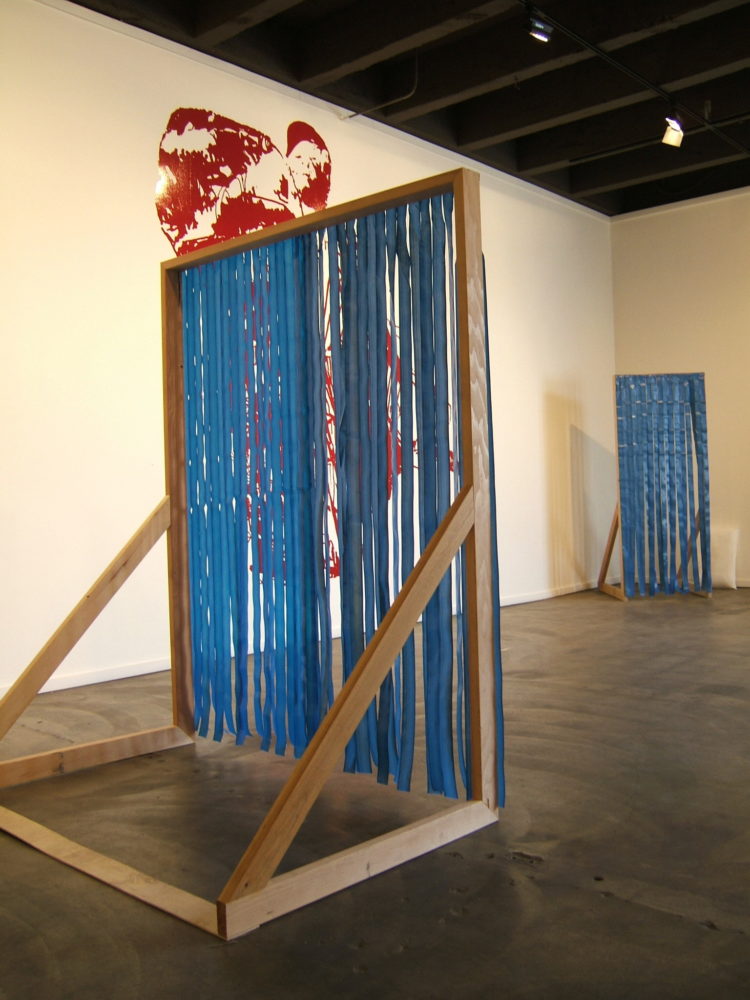
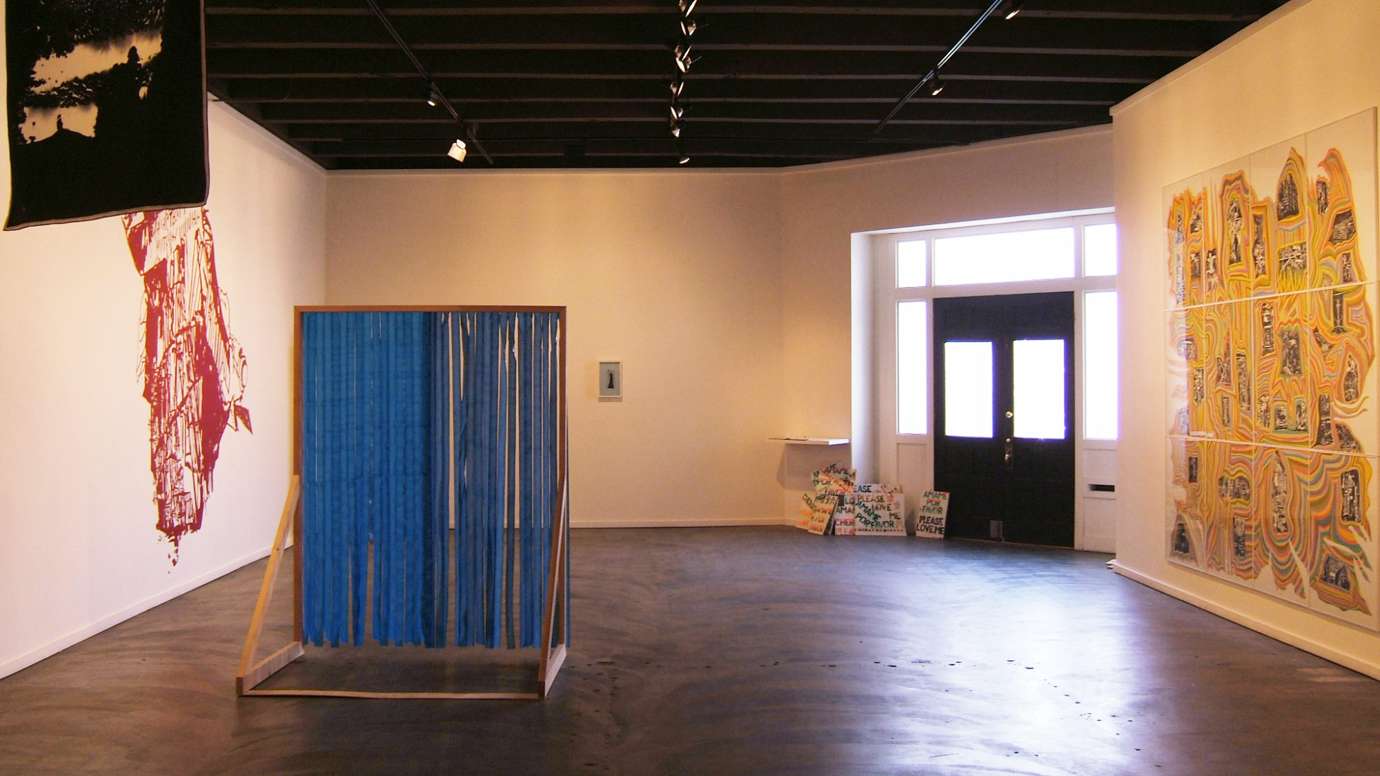
Shortly after graduate school, I was offered a two person show with Bonnie Collura at the Walker Art Center. Previously I had been making both large paintings on paper and temporary wall paintings using mismatched paint from the hardware store. As I was on one side making work that was meant to persevere and retain a specific form at the same time, I was also making something that would only be visible for a week or two before being painted over. The latter pushed me away from making works that were precious and I was able to experiment more with production, placement, and process. The first wall pieces were very planned out up front, but then I started to be more flexible in the decision making during the installation process. There were moments where the architecture was already dictating so much in relation to a viewer’s experience that I wanted to think of ways the work was subjugated by the architecture, but could also introduce embellishments that contradicted the veneer that the architecture was invoking. Examples of this were introducing artificial pillows that were painted white into a hallway where the architecture was corporate or using plastic table skirting to replace a motif that an interior decorator had put into place. I think I became used to juggling lots of types of imagery and materials in such a way that the work started to resemble a group show or a mix tape. 

A: Are there any artists or exhibitions that have resonated with you lately or have been of particular interest?

SC: I was at the Bologna Art Fair, right before the COVID-19 outbreak. I have always loved post-war Italian art, but there were some artists that I had not been familiar with such as Pino Pascali and Mario Airó. 

Also, since last year or so, I can’t get over how great Eugenio Espinosa is. It’s funny because I was recently asked this question in particular about painters—which I describe myself as— and I froze. 

But I do have a list of artists that constantly make me very happy: Yevgeniya Baras, Deb Sokolow, Peter Barrickman, George Condo, Alisson Weiss, Ester Partegas, Adel Abdessemed, Steven Parrino and Betsy Coulter’s Instagram feed which is really inspiring.

The last show I saw and loved here in Milwaukee was by Mike Paré and another show by Caroline Kent. 

To see more of Santiago’s work, visit his website and Artadia’s Artist Registry.

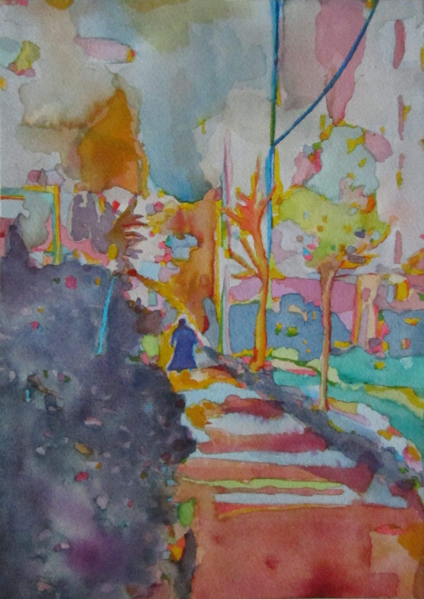
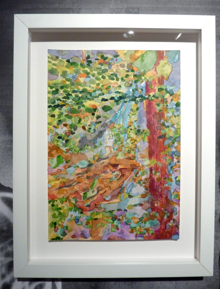
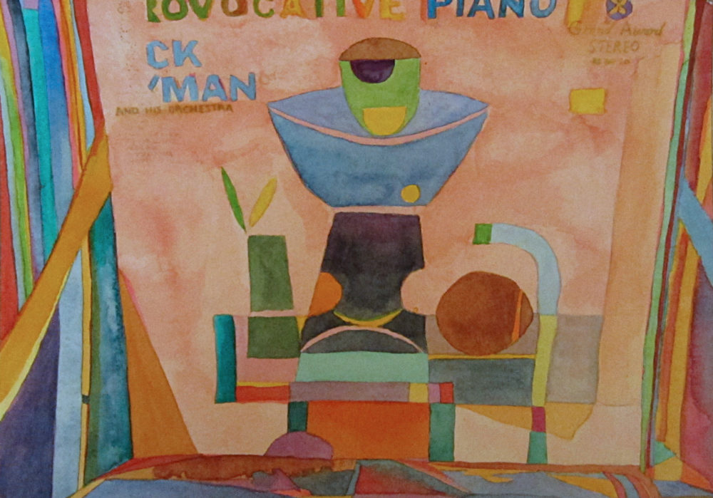
Santiago’s biography and all images courtesy of the artist.

Hex Under the Fall, 2015, Watercolor on paper, 7” x 10-1/4”
Harambee Cloaked Figure Walking, 2015, Watercolor on paper 7” x 10-1/4”
Softer Side of Futurism, 2015, Watercolor on paper, 7” x 10-1/4”